How do I create a responsive slideshow as seen throughout the rest of the preview site?
* The slideshow utilizes RapidWeaver 5's Resources area and you may have up to eight slide images within any given page.
** Images used in the slideshow must be 1400px by 700px for proper responsive image rendering.
1. Before dragging your image to the RW Resources area, you may rename the image after one of the following to assist in keeping your project organized:
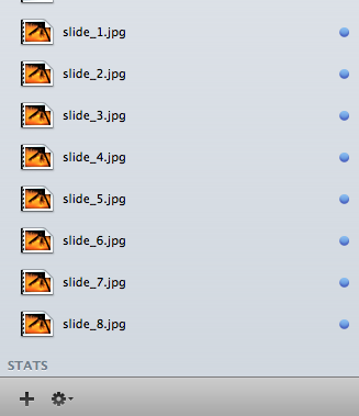
* Remember that the rendering of your image is very precise, so naming your image with a lowercase ".jpg" is paramount.
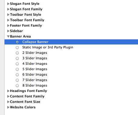
2. Open your page inspector and locate the Banner Area option.
3. Simply select the Built-in Slideshow option.
4. Locate the Number of Slides (SlideShow Enabled) option.
5. Select the number of slides you will use within your theme's slideshow. Figure 1: If you would like to see slides 1 through 3 displayed, the "3 Slider Images" should be chosen.
Figure 1
6. Locate the Sidebar area and paste the following HTML so that the images display in the Extra Content 1/Banner area:
If you would like to add more than two images, simply add another list item following the pattern of Image 04, Image 05, etc. The following example showcases how the maximum 8 images may be displayed:
7. In order to select which images you would like to be displayed and to choose different photos within different slideshows throughout one project, place the following snippet in your CSS directing which photo you would like associated with your HTML coding:
.cb-slideshow li:nth-child(1) span {
background-image: url(%resource(slide_1.jpg)%);
}
.cb-slideshow li:nth-child(2) span {
background-image: url(%resource(slide_2.jpg)%);
}
.cb-slideshow li:nth-child(3) span {
background-image: url(%resource(slide_3.jpg)%);
}
*** The number in the, ".cb-slideshow li:nth-child(1) span" portion refers to what number slide, and the "slide_1.jpg" refers to the name of the image in your Resources area. For instance, if you would like the 6th slide of your slideshow to display a photo named, "slide_20.jpg"
.cb-slideshow li:nth-child(6) span {
background-image: url(../../resources/slide_20.jpg);
}
6. Preview your page and enjoy your built-in responsive slideshow.
** Images used in the slideshow must be 1400px by 700px for proper responsive image rendering.
1. Before dragging your image to the RW Resources area, you may rename the image after one of the following to assist in keeping your project organized:
* Remember that the rendering of your image is very precise, so naming your image with a lowercase ".jpg" is paramount.
2. Open your page inspector and locate the Banner Area option.
3. Simply select the Built-in Slideshow option.
4. Locate the Number of Slides (SlideShow Enabled) option.
5. Select the number of slides you will use within your theme's slideshow. Figure 1: If you would like to see slides 1 through 3 displayed, the "3 Slider Images" should be chosen.
Figure 1
6. Locate the Sidebar area and paste the following HTML so that the images display in the Extra Content 1/Banner area:
<div id="myExtraContent1">
        <ul class="cb-slideshow">
            <li><span>Image 01</span></li>
            <li><span>Image 02</span></li>
        </ul>
</div>
If you would like to add more than two images, simply add another list item following the pattern of Image 04, Image 05, etc. The following example showcases how the maximum 8 images may be displayed:
<div id="myExtraContent1">
        <ul class="cb-slideshow">
            <li><span>Image 01</span></li>
            <li><span>Image 02</span></li>
 	   <li><span>Image 03</span></li>
	    <li><span>Image 04</span></li>
	    <li><span>Image 05</span></li>
	   <li><span>Image 06</span></li>
	   <li><span>Image 07</span></li>
	   <li><span>Image 08</span></li>
        </ul>
</div>
7. In order to select which images you would like to be displayed and to choose different photos within different slideshows throughout one project, place the following snippet in your CSS directing which photo you would like associated with your HTML coding:
.cb-slideshow li:nth-child(1) span {
background-image: url(%resource(slide_1.jpg)%);
}
.cb-slideshow li:nth-child(2) span {
background-image: url(%resource(slide_2.jpg)%);
}
.cb-slideshow li:nth-child(3) span {
background-image: url(%resource(slide_3.jpg)%);
}
*** The number in the, ".cb-slideshow li:nth-child(1) span" portion refers to what number slide, and the "slide_1.jpg" refers to the name of the image in your Resources area. For instance, if you would like the 6th slide of your slideshow to display a photo named, "slide_20.jpg"
.cb-slideshow li:nth-child(6) span {
background-image: url(../../resources/slide_20.jpg);
}
6. Preview your page and enjoy your built-in responsive slideshow.