
Welcome to the
Glamour theme for
RapidWeaver
Your next level solution for building websites whether
personal, professional or client based.
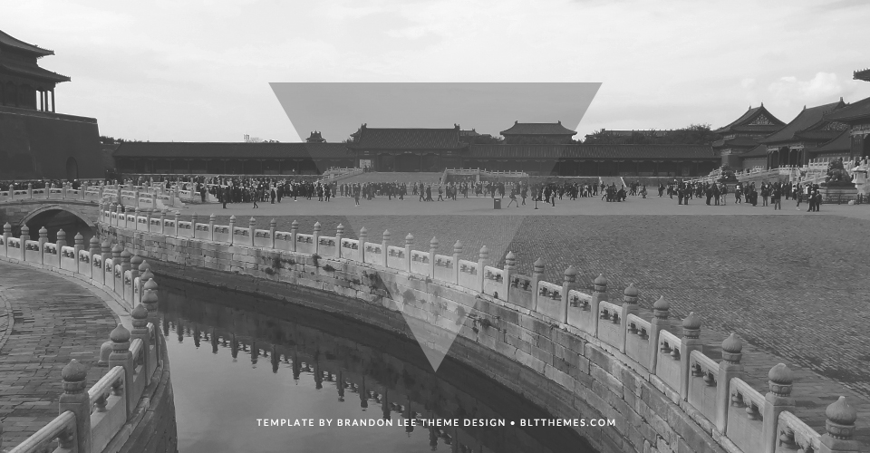
Tutorials Below & SlideShow Example Page
easily replace the text below with your own copy to inform your guests of your latest newsLorem ipsum dolor sit amet, consectetur adipiscing elit. Aliquam non ligula ipsum. Curabitur arcu felis, suscipit nec fermentum venenatis, bibendum eget lacus. Nunc eget dolor leo. Etiam dui ipsum, aliquam et interdum a, volutpat eu ligula. Ut eu elit augue, sit amet feugiat quam. Vestibulum turpis mauris, condimentum at ornare eu, dictum ut ligula. Morbi venenatis vulputate lectus non pellentesque. Duis sed mauris libero, ac dignissim ipsum. Nullam ipsum metus, ultrices sed viverra a, mollis ac nisi.
Lorem ipsum dolor sit amet, consectetur adipiscing elit. Aliquam non ligula ipsum. Curabitur arcu felis, suscipit nec fermentum venenatis, bibendum eget lacus. Nunc eget dolor leo. Etiam dui ipsum, aliquam et interdum a, volutpat eu ligula. Ut eu elit augue, sit amet feugiat quam. Vestibulum turpis mauris, condimentum at ornare eu, dictum ut ligula. Morbi venenatis vulputate lectus non pellentesque. Duis sed mauris libero, ac dignissim ipsum. Nullam ipsum metus, ultrices sed viverra a, mollis ac nisi.
Tutorials
easily replace the text below with your own copy to inform your guests of your latest newsResponsive Slideshow
* Images used in the slideshow are 1400px by 650px. Slideshow can only be applied to the first content area/slide as seen in the Preview Site.
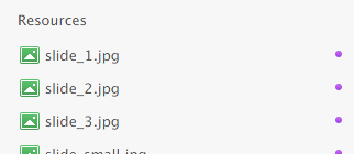
1. Before dragging your image to the RW Resources area, you may rename the image after one of the following to assist in keeping your project organized:
* Remember that the rendering of your image is very precise, so naming your image with a lowercase ".jpg" is paramount.
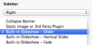
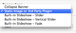
2. Open your page inspector and locate the Banner Area option.
3. Simply select the Built-in Slideshow - Slider option for a sliding effect, or the Built-in Slideshow Fade option for a fading effect.
Figure 1
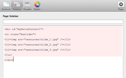
4. Locate the Sidebar area and paste the following HTML so that the images display in the Extra Content 1/Banner area:
<div id="myExtraContent1">

	<ul class="bxslider">

		<li><img src="%resource(slide_1.jpg)%" /></li>

		<li><img src="%resource(slide_2.jpg)%" /></li>

		<li><img src="%resource(slide_3.jpg)%" /></li>

	</ul>

</div>
If you would like to add more than three images (or less), simply add another list item following the pattern seen above etc. The following example showcases how 8 images may be displayed within one on your project page's slideshows:
<div id="myExtraContent1">
<ul class="bxslider">
<li><img src="%resource(slide_1.jpg)%" /></li>
<li><img src="%resource(slide_2.jpg)%" /></li>
<li><img src="%resource(slide_3.jpg)%" /></li>
<li><img src="%resource(slide_4.jpg)%" /></li>
<li><img src="%resource(slide_5.jpg)%" /></li>
<li><img src="%resource(slide_6.jpg)%" /></li>
<li><img src="%resource(slide_7.jpg)%" /></li>
<li><img src="%resource(slide_8.jpg)%" /></li>
</ul>
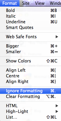
</div>5. IMPORTANT: Highlight the following HTML snippet in your sidebar and click the Ignore Formatting option found in the Format area of the RapidWeaver software. The code will turn light pink when performed correctly.
6. Preview your page and enjoy your built-in responsive slideshow.
Static Banner Image
* We recommend a banner image of 1400px by 500px. Static banner image can only be applied to the first slide.
1. Before dragging your image to the RW Resources area, we recommend you rename the image “banner.jpg”
2. Open your page inspector and locate the Banner Area.
3. Simply select the following options: Static Image or 3rd Party Plugin (Static Image Enabled)
4. Copy and paste the following code into your sidebar area with the name of the image you have dropped into your Resources area. Example: The page will display banner_1.jpg
<div id="fs"><img src="%resource(banner.jpg)%" alt="My Image"/></div> 5. Preview your page and enjoy your responsive banner image.
Social Icons
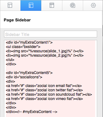
1. Open your page inspector and click on the Sidebar option.
2. Copy and paste the following code into your page's sidebar:
<div id="myExtraContent5">
<div id="socialIcons">
<div>
    <a href="#" class="zocial icon googleplus flat"></a>
    <a href="#" class="zocial icon twitter flat"></a>
    <a href="#" class="zocial icon soundcloud flat"></a>
    <a href="#" class="zocial icon facebook flat"></a>
    <a href="#" class="zocial icon pinterest flat"></a>
    <a href="#" class="zocial icon vimeo flat"></a>
    <a href="#" class="zocial icon linkedin flat"></a>
</div>
</div>
</div><!-- #myExtraContent -->
3. Replace the # with the page url your social icon is associated. For example, if you would like your twitter icon to link to your own twitter page, the code snippet would look like the following:
<a href="http://twitter.com/bltthemes" class="zocial icon twitter flat"></a>4. Highlight your inputted code and click on Format and continue to enable the option "Ignore Formatting."
5. Preview your page and enjoy built in social icons. * For a full list of social icons, visit the index at Dexterity - Social Icons Tutorial
Full Menu Background
Image being used is 1260px by 900px.
1. Create a full screen menu background image. The following example uses the file name, “menu.jpg”
2. Move the image to your Resources area. (Figure 1)
3. Open your page inspector. Insert the following snippet in your custom CSS area. (Figure 2)
* banner.jpg is the name of the image file being used.
/* Full Background Image */
.cd-nav { background-size: cover; background-repeat: no-repeat; background-image: url("resources/banner.jpg");}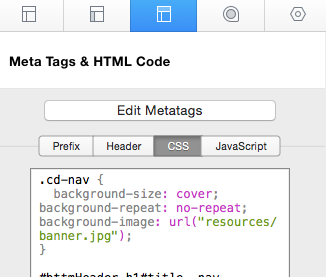
How do I create a retina ready image links as seen on retina enabled themes by Brandon Lee Theme Design?
Some of Apple’s newest devices feature the Retina Display which is a screen that packs twice as many pixels into the same space as older devices. Put simply, sometimes your original sized images will appear blurry on retina display devices. To ensure clarity on these user products, you may take advantage of Emotion's retina ready feature. Use when necessary as a double sized image takes longer to load than original sized images.
1. First, create an image that is 2 times the size of the image you would like to display at high quality on retina capable devices including the iPhone, iPad, and MacBook Pro Retina.
*Ensure that the image that is 2 times the size of your original image is sharp. The following process will not work if one were to simply take a photo and double its size in photoshop. See figure 1:
Figure 1:
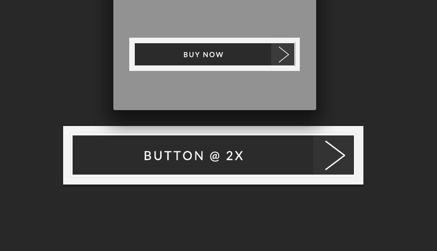
* "@ 2X" on the actual image is for display purposes only. You will want to ensure that both images are exactly the same outside of the size.
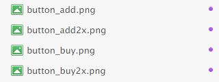
2. Name the original image size (@ 1x) as you normally would. Example: button.png
3. Name the image that is doubled in size as so: button2x.png
* Because Volante is retina ready, when a page is loaded on a retina device, the original button.png file with automatically be replaced with the button@2x.png to ensure that your image looks sharp. Ensure that when you add the 2x ending to those images twice in size, the x is lowercased as coding is very specific.
4. Drag and drop both images into your Resources area:
5. Copy and paste the following code into your content area:
<a href="#"><img src="%resource(button.png)%"></a>
6. Preview your page and enjoy an automatically replaced image on retina devices.