


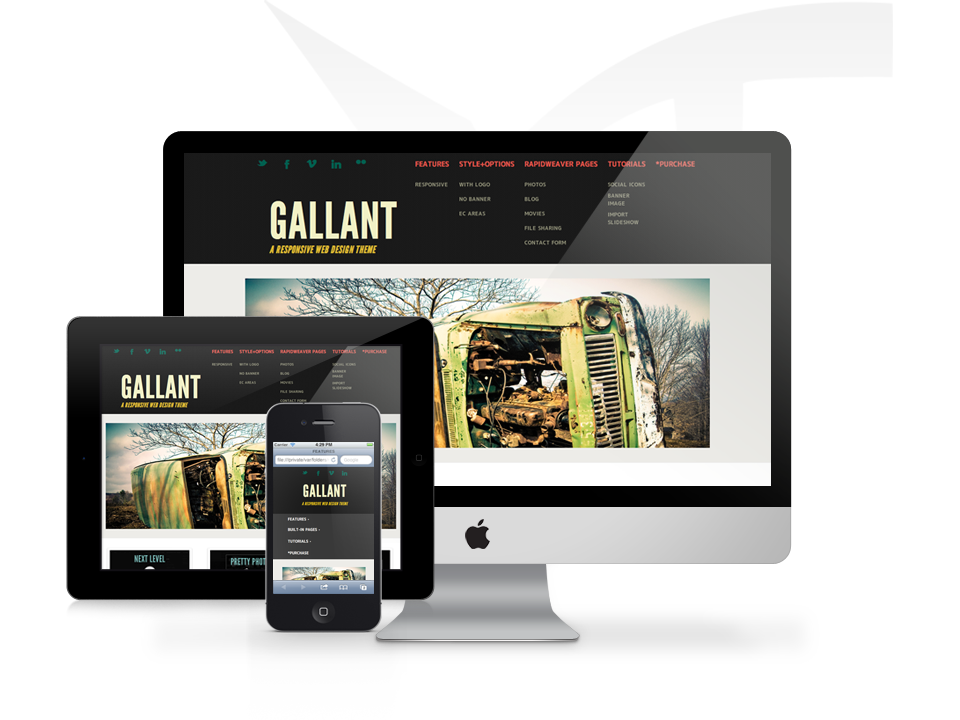
WELCOME TO GALLANT. I'M RESPONSIVE.
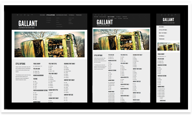
The Gallant theme is responsive which means your website will respond to and enhance the user experience whether your guest is displaying your project on a 27 inch screen, iPhone, and/or the in-between. Feel free to resize your browser to see how Gallant appears at different browser widths by dragging the bottom right corner of your window with your mouse or simply view on your iPad and iPhone.
In The Details
Gallant was designed and built with great detail and subtlety to help make your site pop[ular]. Choose between 4 different header and footer textures and make your site become that much more unique.
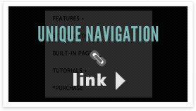
Navigation Menu
Allow Gallant's navigation menu to automatically respond to your user's browser width. Dropdown menus are activated on click to ensure compatibility on mobile touch devices.
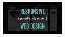
Media Queries
Gallant utilizes the power of CSS media queries to ensure that your project is enhanced at various browser widths for a great user-focused experience.
Take Advantage of Gallant
Want to replicate the "Features" page without using a number of snippets and code? Take advantage of your Gallant theme by using Yourhead's Stacks Plugin page along with Joe Workman's Fluid Columns and Joe Workman's Fluid Image stack (All Plugins Sold Separately).
Extra Content Footer
This is an example of how extra content may be added to your footer area. View Gallant's EC Areas page for more theme specific Extra Content information and click the following for general Extra Content Help.
Header Height
Due to the nature of Gallant's design, the header is a fixed height of 210 px and supports up to 6 child/subnavigation links per parent.
